Kenoma: Action Without Action
Seeing Things: Bichromatic Action (Without Action)
What a video game looks like is quite important. Before anything else, people will typically know and remember what a game looks like. And beyond first impressions, a game’s visual style must also match everything else about it. There is an intuitive sense that the aesthetic sensibilities of, say, an Unreal Engine 5 “Bob-Omb Battlefield” remake using un-styled realistic assets, is wrong. Super Mario lends itself best to cartoonish, silly visuals where Mario’s nose bobs around as he runs, not gritty realism.
Kenoma’s visual style is no different, in that it’s intending to present the game’s whole identity visually. And I do think it achieves that very well – you can immediately recognize the kind of game you’re in for by the visual style. Not necessarily the mechanics, but the kind of experience you’re getting yourself into. There were three guiding principles that I followed while making the graphics: simplicity, abstraction, and evocation.
First, I’d like to define what these principles mean to me, because I didn’t actually sketch them out to myself this way while working. They’re more extrapolations of the ideas I based my work on. The kind of thing you would put into a design document or retrospective. Simplicity: the graphics should be straightforward and not overly dense. Abstraction: there should be enough vagueness in the images, to allow people to come to their own decisions on exactly what is depicted. Evocation: every environment needs a specific kind of “vibe”, ritual-ish and mystical. They should have a real sense of otherness.
Keeping things simple was priority one, for multiple reasons. The first is ease of creation. I’m making this game all by myself, and I need to keep things simple so the game doesn’t take a decade to make. A simpler design is easier to draw. This simplicity of creation also helped cement the choice of 1-Bit color: it is much easier to choose what color a pixel is when you have only two possible colors. Instead of wondering what shade of green a tree’s foliage should be, my main concern has to be making it even resemble a tree in the first place.
The second reason is for readability. Easy identification of your surroundings in any game is important, and even more so in a game with two worlds to traverse. Simple, clean graphics with a lot of negative space allow you to most effectively depict both worlds at once, with overlays and such. Could you imagine trying to see two places overlaid on top of each other when both are full color, with plenty of detail and bright colors? It would be chaos.
As for abstraction, there are several tools that help to bring about the general vagueness of form I desired. Most obviously, Kenoma is pixelated. A classic indie tradition. I am not hearkening back to some rose-tinted past, or emulating the limits of an old system (what console ever looked like this?), or trying explicitly to tie the game into an indie identity. Most basically, I chose to use pixel art because I have more experience with it and better tools to create it than art of higher resolution. Which means the art is done more quickly, and with more effect.
The second reason for pixelation is that core abstraction. Lineart and beautiful little details create less of it than big blocky pixels. Not because they’re inherently less abstract, but because they are more precise tools. When you’re working with pixels large enough to count, you can expect the player to accept stranger shapes as normal. It’s only natural; no one can depict a human face accurately at 16x16 scale.
Combining this pixelation with the 1-Bit color scheme allows an incredible amount of abstraction while keeping a unique sense of style. The visual identity is clear and images simple, but they still allow players to see what they want to see, in a sense. These low-res two-color images are sort of scaled up in the mind. No one ever hallucinates a high-detail image over top of pixel graphics, but your mind interprets them automatically, seeking patterns and the like. That helps to turn the art assets into something far greater just through interpretation, which is useful for me and hopefully interesting for players. I can design assets that only evoke the idea of real-world objects, or even things that evoke nothing at all; people will regardless find ways to make sense of it that are satisfying and interesting to them.

The boots, cloak, and posture make it clear that this creature on the far-left is some sort of person. But what exactly this person looks like is hard to describe, and impossible to scale up – this design is custom-built for the context it finds itself in.
As a point of design intent, “evocation” is hard to explain. I wanted every location to feel mystical, alien, and for lack of a better word, portentous. Like there was some clear intent and meaning, some alien tradition guiding the design of the world that you aren’t privy to, but the characters are. A terrible destiny or hidden truth just beyond what you can see, something massive lurking in the details of the buildings and the imagery carved into the walls and so on. The kind of thing that really feels like it could be explicable with a deep and nuanced survey, beyond what you can achieve in-game. Beyond this, there’s nothing categorical I can say that will explain how this concept influenced the visual design. I just know that it guided my hand, made me consider deeply what to put where and why, and that I think I achieved it well.
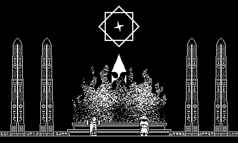
This image is a clear example of the evocation I’m going for, and that I feel pervades the game world. I do not know how else to describe it to you.
With that being said, this style is not without its downsides and limitations. First and most easy to recognize: it’s not the prettiest thing out there. Not to say that it looks bad, or that there aren’t uglier games, but you certainly can’t describe Kenoma as being straightforwardly beautiful. Straightforward beauty isn’t always the best thing to strive for, but it certainly turns more heads.
Secondly: this visual style is very bad for grounded, normal imagery. This doesn’t really apply to Kenoma, but if for whatever reason you think this style would be an interesting thing to take inspiration from, keep that in mind. A more realist, down-to-earth design in this 1-Bit pixel style will come off as awkward and stilted, precisely because of that lack of detail and abstraction that’s baked in. You can certainly depict something like a field of flowers or a human face with only two colors, but it would take far more pixels than Kenoma is able to dedicate to the endeavor. Even with dithering!
Finally, the contrast is a blessing and a curse. Pure white on pure black is certainly striking visually, and will often stand out when next to all sorts of bright colors. But such high contrast can be a strain on the eyes if looked at too long. Especially when the white is on a screen, blasting your eyes with bright lights in a dark room or some such. This problem is, I think, un-fixable. Kenoma includes a band-aid fix for this in its color-contrast mode, where black and white are replaced by muted colors that contrast by hue rather than brightness, but it just doesn’t have the same visual punch.
Choices of stylization and presentation are, at their core, about representing your work’s contents as effectively and accurately as possible while keeping an eye towards catching other people’s. I believe that I’ve given Kenoma the best chance I could in these terms. Hopefully it works out.
* * *
BrukhoLevin Mailing List: https://www.brukholevin.com/mailinglist.html
KENOMA on Steam: https://store.steampowered.com/app/2933260/Kenoma_Action_Without_Action/
KENOMA on itch: https://brukholevin.itch.io/kenoma-action-without-action
KENOMA press-kit [for journalists]: https://www.brukholevin.com/kenoma_presskit.html
Leave a comment
Log in with itch.io to leave a comment.